San Francisco Shock 2022

The San Francisco Shock are an American professional Overwatch esports team based in San Francisco, California - the home of earthquakes, which launched the theming of the brand for the 2022 season of Overwatch League.
As lead designer, I created a bold yet readable style that evoked the cracks, quakes and disruption of an earthquake, while maintaining a clean aesthetic. Inspired by words such as, “Tremor,” “Quake,” “Crack,” and “Disruption” I incorporated classic crack textures and fractured backgrounds, using fissures as cutouts to add depth. The social media graphics for San Francisco Shock's Twitter utilized their signature black, white, and gray with pops of orange—orange was used sparingly to highlight key information. By translating the team's colors into cracked and shattered elements, I made graphics that effectively captured the energy of an earthquake while adhering to the Shock's core visual identity.


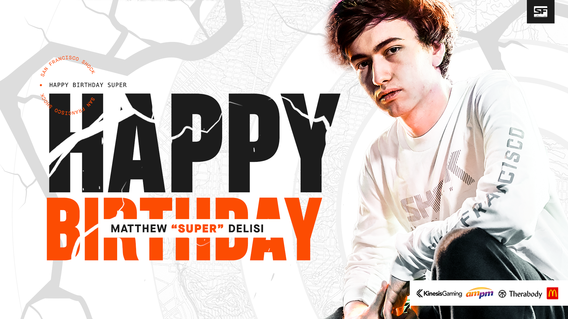


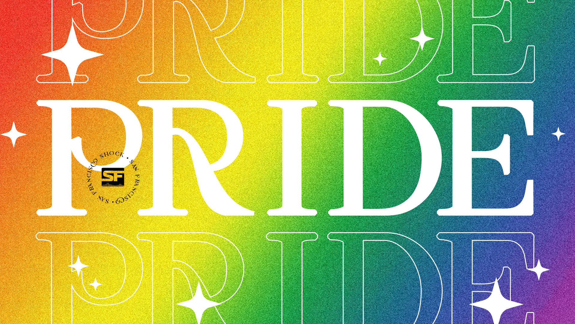
The following are graphics created as wallpapers for the fans, some following themes such as Pride Month, Mothers Day, Women's Day and more while others I let my creative juices flow and based around characters that the team used.


Custom Chair Designs
I had the chance to design custom gaming chair designs for both NRG and San Francisco Shock, allowing for a fun and unique chair that fans could purchase.
I created initial concepts that incorporated their signature colors, logos, and other design elements unique to each team. These concepts were refined and iterated upon through feedback and collaboration with the teams until a final design was approved. The result was a set of custom gaming chairs that perfectly matched each team's branding, creating a cohesive and impactful visual presence for the players and their fans alike.


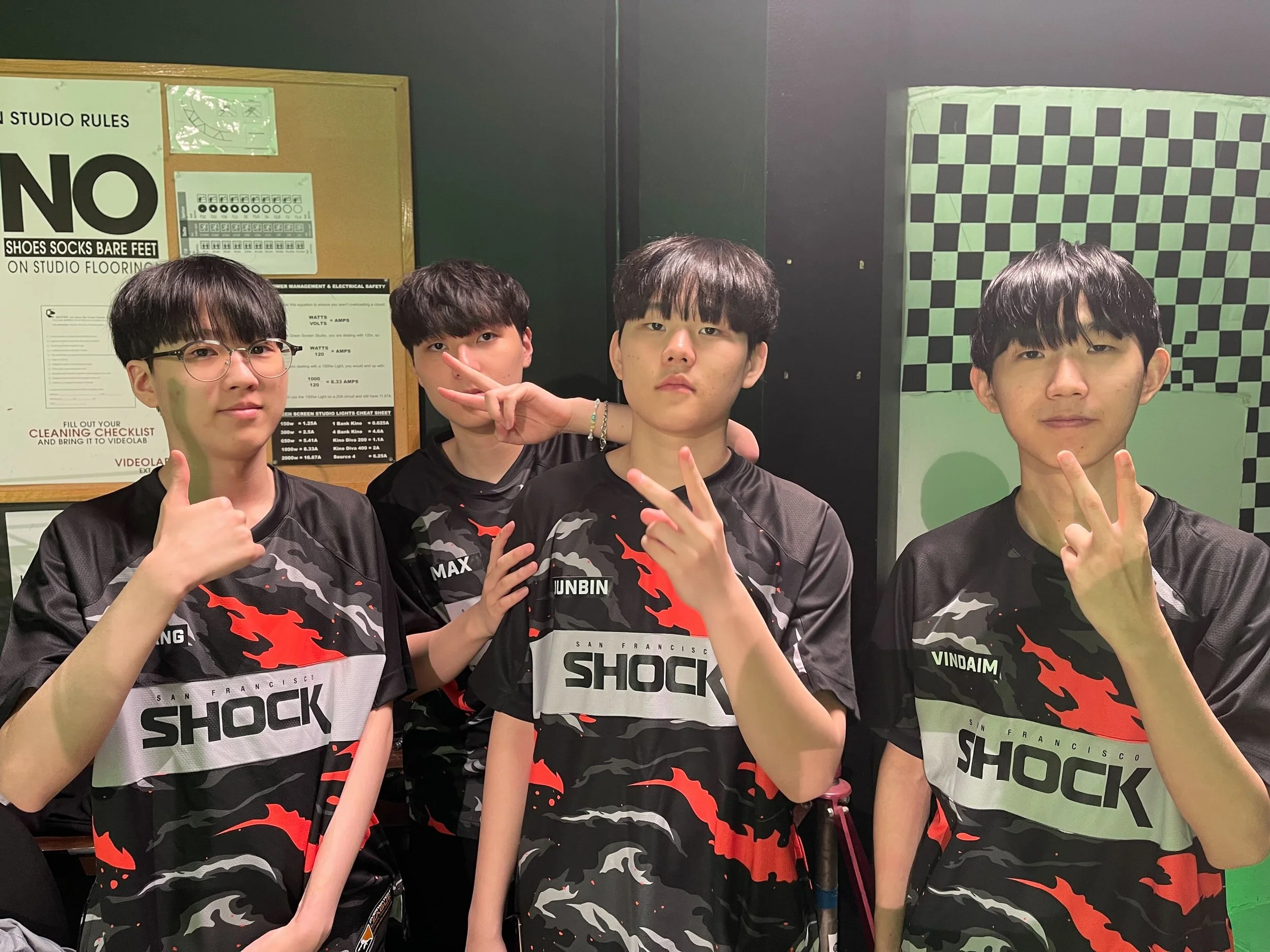
San Francisco Shock Jersey
I worked with the San Francisco Shock and Blizzard’s Overwatch League to create a custom design for Shock. We decided to go with a design that utilizes a bold camo pattern in the team's signature colors of orange, black, and gray. The jersey's base color is black, with the camo design featuring a mix of orange and gray tones layered throughout.
I designed the camo to make sure it can be utilized on a variety of assets and is used as the main branding pattern for 2023, including custom gaming chair, a mousepad, keycaps, social media assets and more.
Overall, the San Francisco Shock's 2023 jersey is a dynamic and stylish representation of the team's identity, showcasing their fearless approach to the game and their commitment to pushing boundaries and taking risks